Solutions
Phyto
Giving a clear, accessible identity to a phytosanitary solutions brand, able to speak to both farmers in the field and professional partners — without falling into a register that's too institutional or too generic.
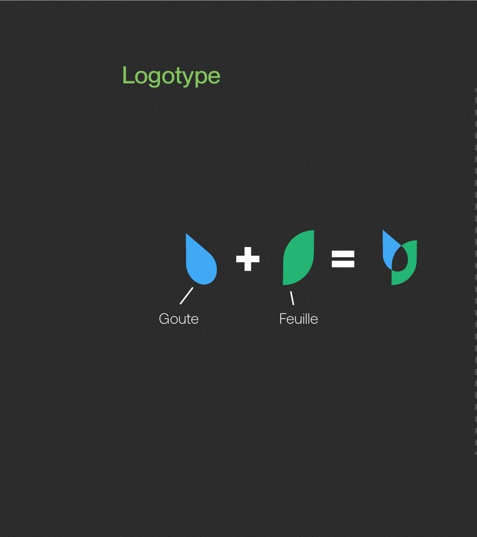
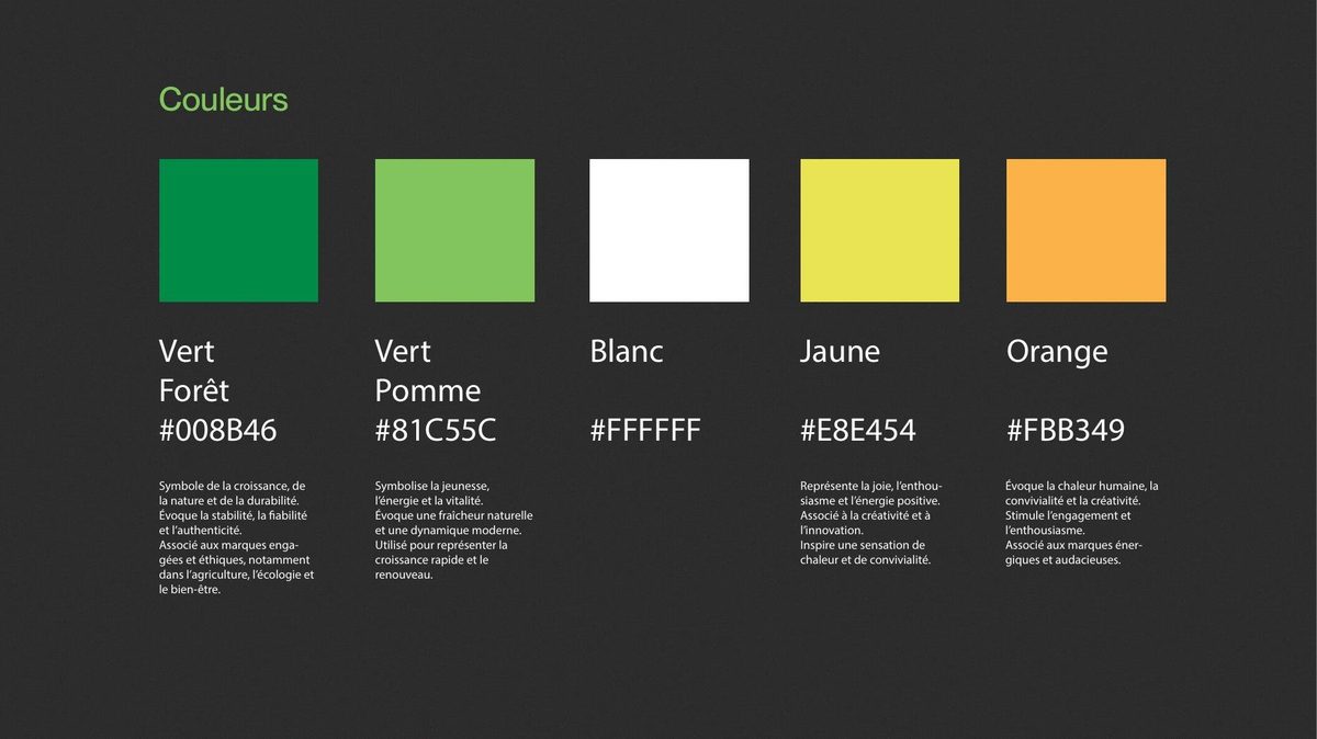
A narrative symbol rather than a simple pictogram: the fusion of a drop and a leaf, representing the point of contact between a liquid product and the brand's agricultural activity. A natural yet lively palette — greens, yellow and orange — evoking nature, growth and positive energy all at once.
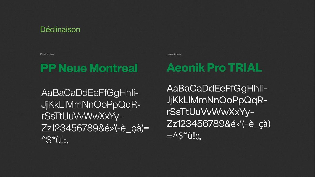
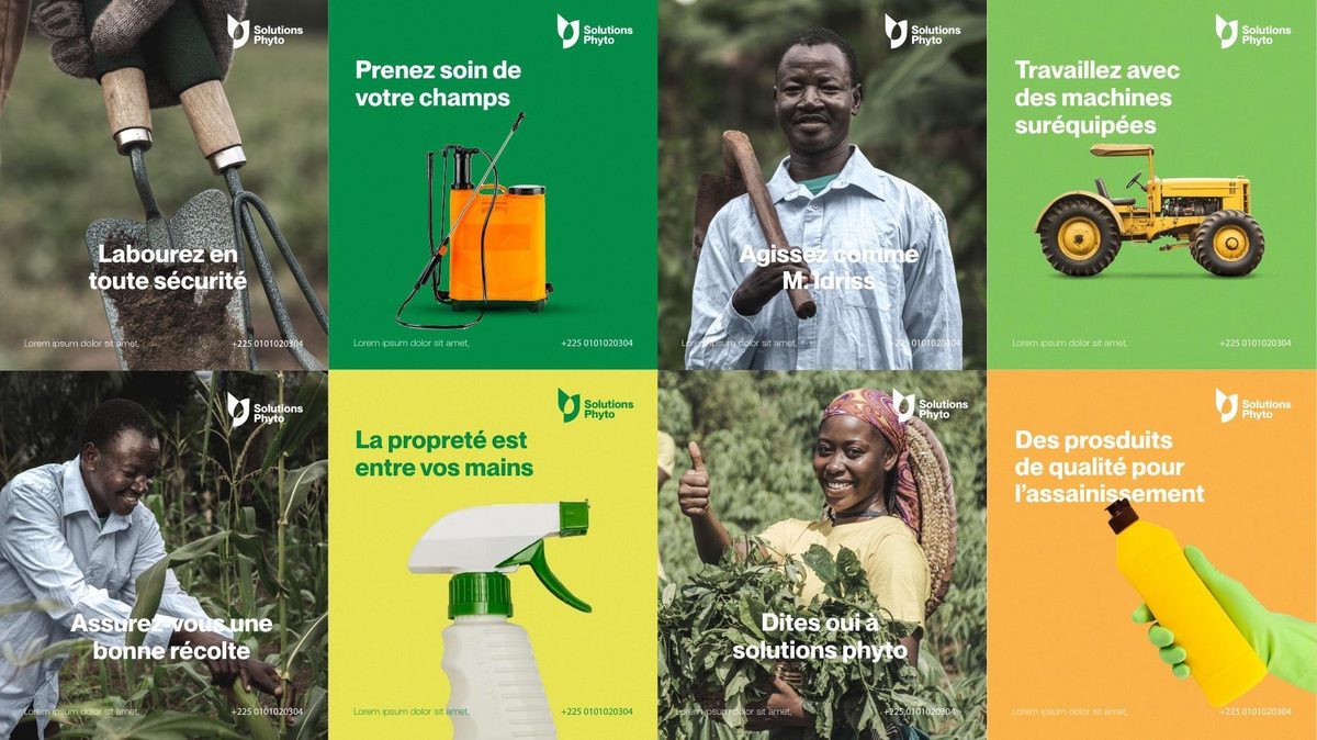
The logotype pairs the symbol (drop + leaf) with a bold, rounded typographic name, for an inseparable whole that's easily recognizable even at small size. The guidelines define the logo's color variations, the typographic hierarchy (PP Neue Montreal for headlines, Aeonik for body text), and a series of campaign visuals featuring real users in the field — plowing, crop treatment, farm machinery — to ground the brand in its target's daily life.