Club des
Héros Parc
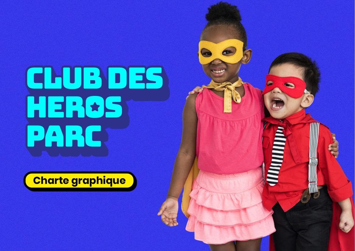
Club des Héros Parc is a children's activity center, designed to offer parents a nearby playful and educational space. The challenge: create a brand identity able to immediately capture a young audience's attention, while staying clear and reassuring for parents.
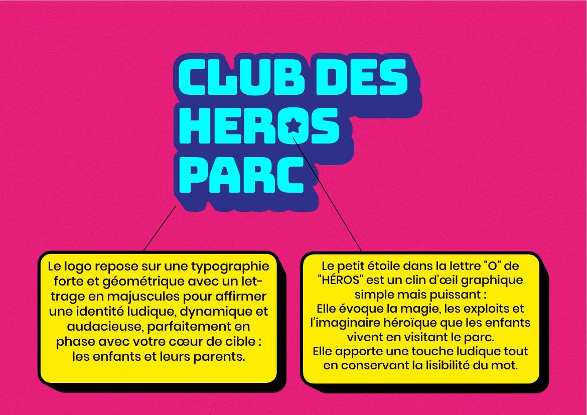
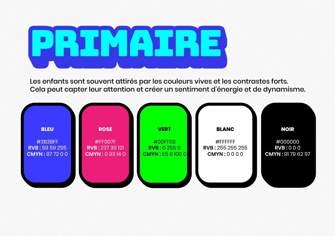
Betting on bright colors and strong contrast — children are naturally drawn to them, creating a sense of energy and dynamism at first glance. The logo relies on bold, geometric uppercase typography, to assert a playful, dynamic and bold identity, in tune with the target: children and their parents.
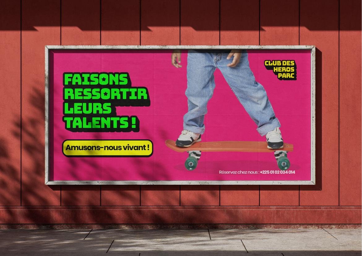
One detail signs the whole identity: the small star that replaces the "O" in "HÉROS" in the logo — a graphic nod evoking the magic and heroic imagination children experience visiting the park, while keeping the word legible. Bungee Layers typography dresses the headlines for a dynamic, colorful feel, while Poppins ensures clear reading across all materials. The complete guidelines cover the logo and its variations, the color system, typography, photo treatment and brand spaces, with concrete applications on signage and stationery.